
Five years ago I wrote here about Suck! Me, our vampire themed foreplay board game, and later about the design updates that came out of playtesting. Both posts ended on a sour note. Apple had rejected the Apple TV version, then pulled the iPad version, and I had a half-finished lesbian edition sitting in a spreadsheet. This post is the happier sequel. The game has been rebuilt from the first line of code as Fangs & Hearts, it runs on iPhone, iPad and Apple TV, it ships in straight, lesbian and gay editions, and it has just gone in for review. Along the way I learned a few things about designing a board game that two people play while they are, quite literally, all over each other. That is what this post is about.
Working With Apple’s Constraints Instead of Against Them
My earlier posts were frustrated with Apple, and I still think the rejection of a text-only game for adults was heavy handed. But when I sat down to rebuild, I read the rejection differently. The reviewer had named three things together: the name, the icon and the content. Each on its own was borderline. Together they made the case for them. So the question became: what can I change that makes the game better, not just more acceptable?
The name was the easiest. Suck! was a pun that worked on a game box and worked against us on a store shelf. Fangs & Hearts names the two things the game is actually about, the vampire’s meter and the hunter’s meter, and it gave us a title graphic and an icon that read as Halloween rather than as a mouth. The icon is a heart with fang marks and a rose. Nobody can call it a body part.

The content decision was harder and, I think, the most useful lesson here. The original Apple TV version had a hidden “clean” mode that swapped rude words for emoji. They maybe treating these hidden modes as a guideline violation, and it actually made the game worse. This time there is one set of content everywhere. The in-game world already had its own vocabulary: stakes, holy oil, feeding fluid, sceptres, the crypt, the confessional. Leaning into that vocabulary on every card made the writing more fun and more consistent, and it meant the same text ships on every platform with nothing to hide. The game is rated 18+, the description says what it is, and the review notes give the reviewer a six-step path to every kind of content. Constraints forced a coherent voice. That is a design win, whatever the gate keepers decides.
The one place I did hold the line was the card text itself. It is the wording from our books, and it uses plain words where the books do. I decided that was the product, and that if review objects I would edit the specific cards they cite rather than water down everything in advance. We will see.
Three Editions, Written Separately
The lesbian edition I promised in 2021 exists, and so does a gay edition. The tempting shortcut was one set of text with the pronouns swapped by the software. I tried it on paper and it produced nonsense: half the activities in the straight set assume a particular anatomy on a particular side, and “his” swapped for “her” does not fix a sentence built around it. So each edition is its own set of files, written and reviewed by a human, with its own cards and its own Perform or Pay activities. The lesbian set has two columns of activities, one for each role, because the pairing supports a lot of variety. The gay set turned out to want a single column, because the two roles were performing near-identical acts, so I kept it to 216 and stopped rather than pad it.
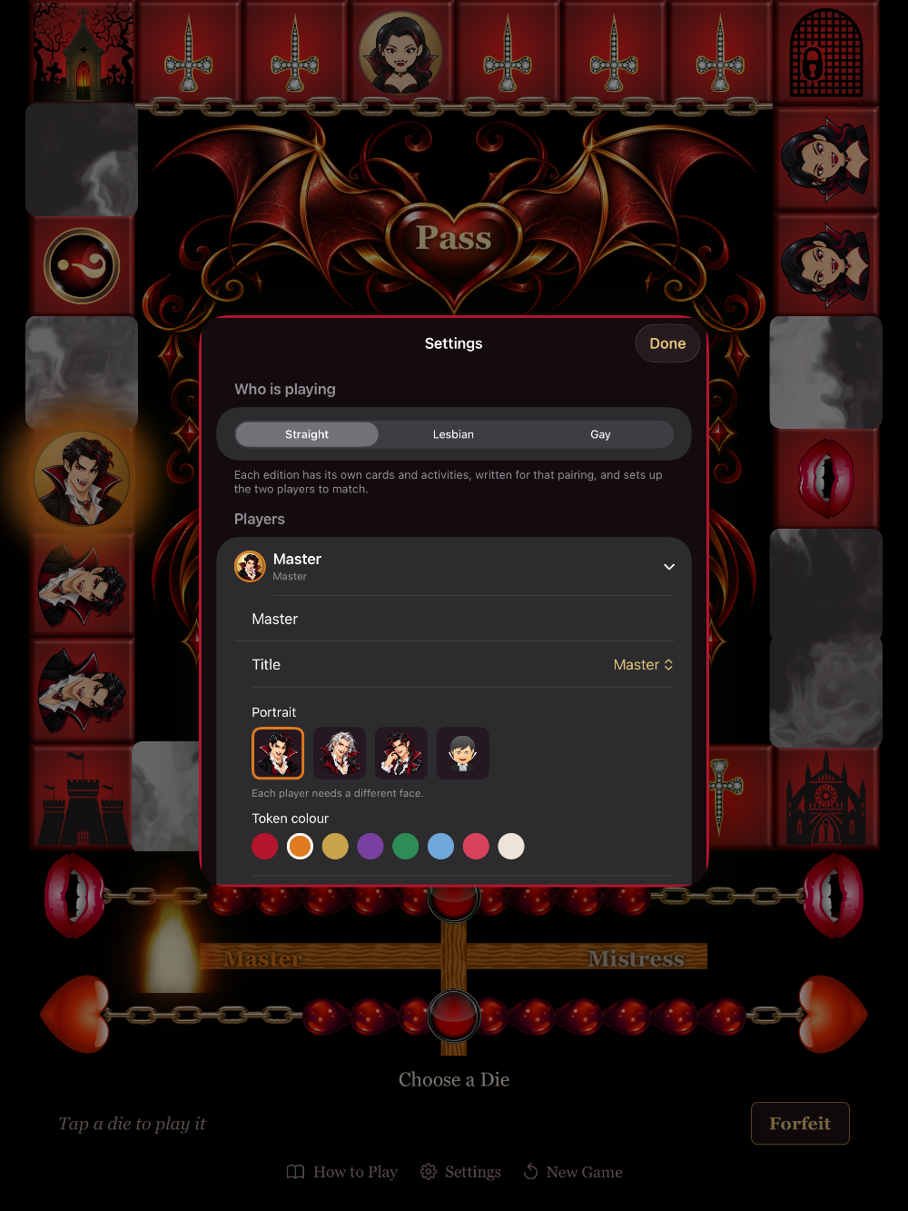
Choose Straight, Lesbian or Gay and the app adjusts dynamically. Both players get their pronouns, their body, their title choices and their token portraits set to match. Nothing in the setup asks a couple to declare their anatomy. An earlier draft did, with a toggle for each body part, and it looked like a form at a clinic. Deleting it was the best settings change I made. I was trying to be more inclusive but I believe the players can adapt the activity ideas using their own judgment and preferences.
Designing for Two People Who Are Not Looking at the Screen
This is the part I most want other adult game designers to take away. A foreplay game is not played like a normal board game. The players are in bed. Their hands are busy, or wet, or both. They look at the screen for a few seconds at a time, then look at each other for a few minutes. Every design decision has to respect that rhythm, and a lot of ordinary game UI conventions fail under it.
- One tap per decision, and a big target. Roll is a tap on the heart or the dice. Moving is a tap on a die. Ending the turn is a tap on the same heart. Nothing is dragged any more. The original had you drag your token around the board, which was charming on a table and hopeless in bed.
- Nothing changes until you can see it. Playtesting found that the square you were heading for changed its owner the instant you chose a die, while your token was still walking. My wife found it confusing every time. Now the board holds still until the token arrives, then the square, the scene, the blood and the controls all change together. If you are only glancing at the screen, the glance has to show one consistent moment.
- Say it, don’t just show it. The word dice and the touch prompts are read aloud by the device’s voice, because at that moment nobody is looking. Everything else is silent, deliberately. An earlier version narrated every bonus and it was like playing with a sports commentator.
- Let the players keep score. The cards used to enforce their blood outcomes: perform this, get that. But a couple in the middle of an activity will improvise, half-do it, swap roles, or decide the other person should pay. Now every card and activity shows a small tally, pre-filled with the likely result, and the two of them tap it to match what actually happened. The game suggests; the couple decides. This one change removed a whole category of “the app got it wrong” moments.
- A timer that does not nag. The word-dice timer ends on a quickening heartbeat and then goes quiet. No buzzer. Nobody needs to be told to stop.
- Keep a wet cloth by the bed. Still the best advice in the rules.
Making the Board Itself the Foreplay
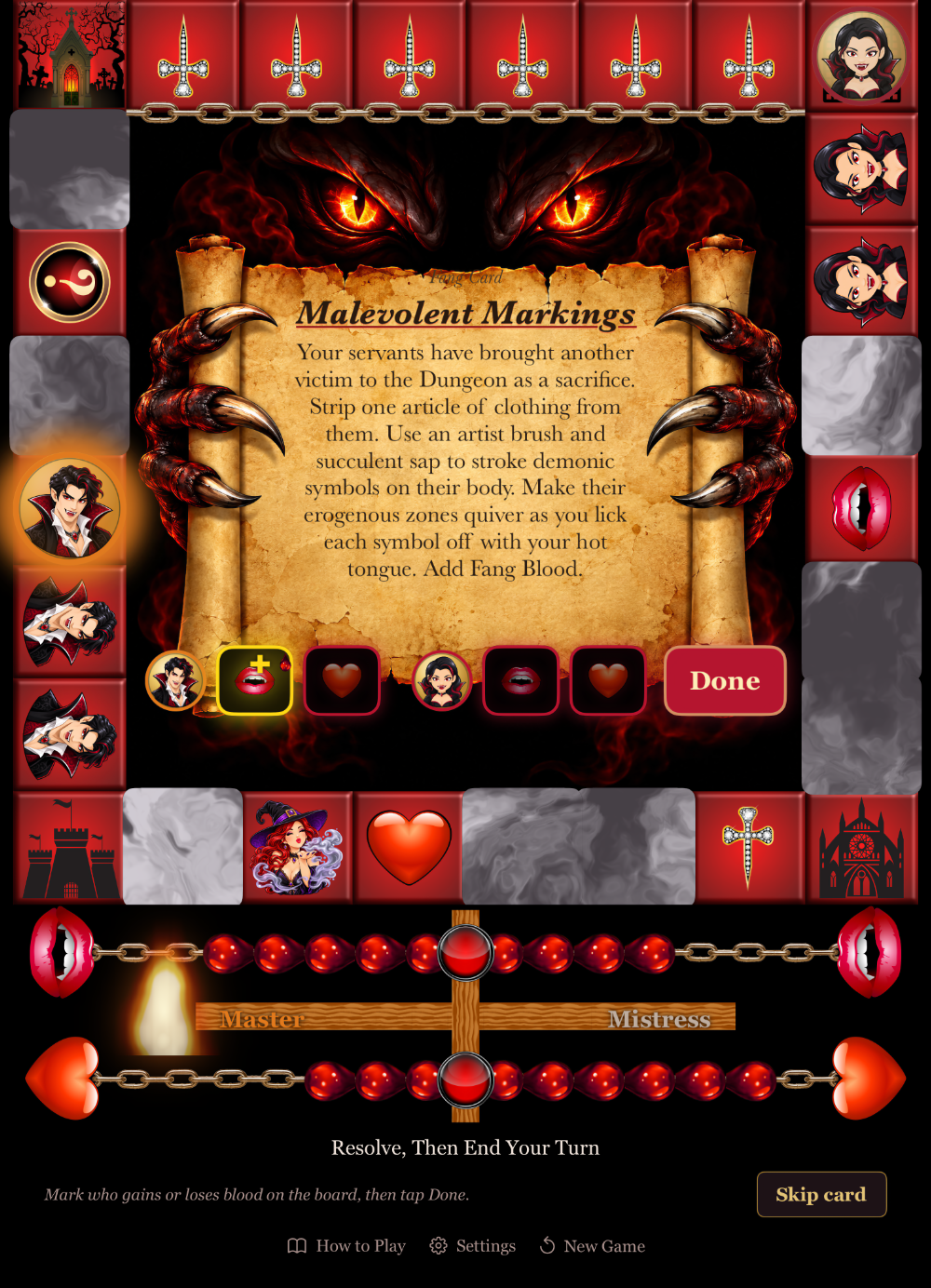
The biggest gameplay change came from a complaint. Playing the original, most turns were just movement: roll, move, take a square, next. The cards and the Perform or Pay activities were where the intimacy happened, and they were a minority of turns. The fix was to attach a small physical act to the board events that happen almost every turn, and keep the cards as the spice.
- Take a blank square as a vampire: lick or kiss exposed flesh on your prey.
- Land on your rival’s square and the hunters stake it: kiss passionately.
- Capture your rival by landing on them: they strip one item.
- Trespass on a locked side: the owner feeds on the trespasser, or you both kiss.
We call them touch rituals, and they appear on a plaque under the scene inside the frame. My wife’s reaction when I described them was “then they’ll never want to finish the game,” which is exactly the point. The baseline rhythm of the game is now intimate, and the cards raise the stakes rather than carrying the whole load. Couples who want a faster, drier game can switch the rituals off.
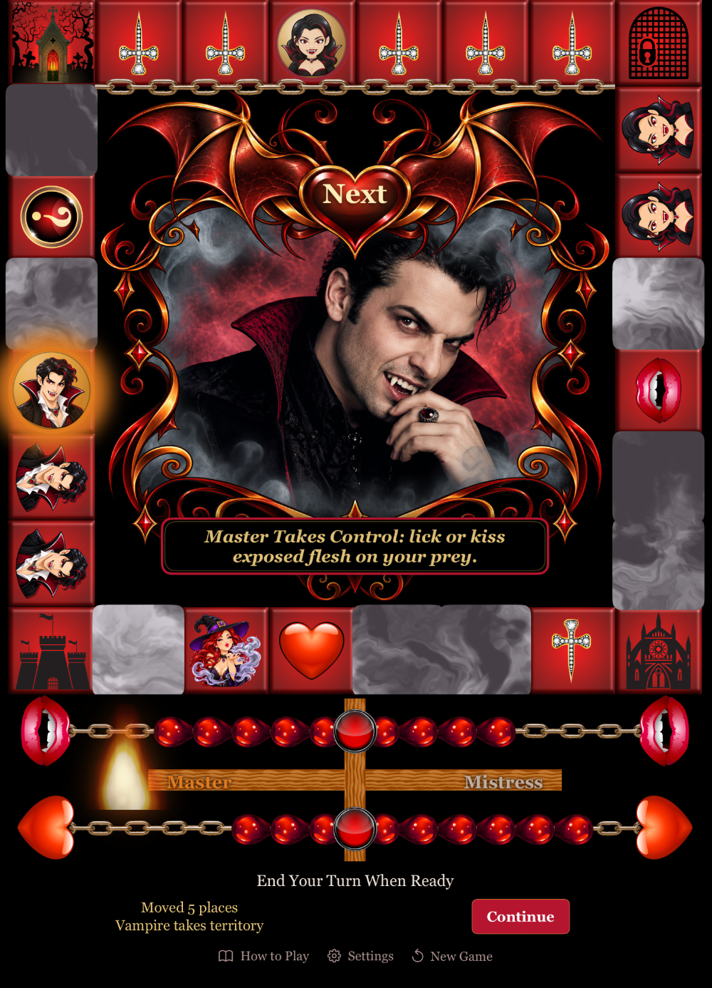
The corners got the same treatment. In the original they were “protected squares”, which is a rule, not an experience. Now each corner is somebody’s ground. Walk into your own lair and you spring a trap on your prey. Walk into your partner’s lair and you are the prey, and they perform on you. The Church makes you the hunter; the Tomb makes you the hunted. It is the only place in the game where the player whose turn it is not gets to act, and it turned four dead squares into the moments people talk about afterwards. For board game designers: this is a cheap mechanic. Four corner cards and a rule about who reads them would do it on a physical board.
Pacing a Game That Has to End
The original had a Quick game and a Full game, a veto system, and a Perform or Pay rule that only ever took blood away. Playtesting the rebuild, games ran long, and I eventually saw why: the one recurring event could only move a meter backwards, in a game won by filling meters. Three changes fixed it, and each one also simplified the rules.
- Performing earns blood. Perform or Pay opens with a drop already marked for the performer. Keep it, make the other player pay instead, or clear it and pass. The veto became unnecessary and was removed.
- One game length. First meter filled wins. The Full game produced strange end-game contortions and nobody chose it.
- The win waits for you. Filling a meter no longer slams the win screen over the current turn. You finish what you were doing, and the heart reads Finish when you are ready.
People’s attention spans are shorter than they were when I designed the first version. A game that reliably ends in an hour, and that can be extended by lingering over the activities rather than by grinding out more turns, is the right shape for this audience.
Building It With an AI Collaborator
I did not write this version alone. I built it with Claude, working inside my code editor over about three weeks of evenings. I want to be specific about what that was like, because “AI wrote my app” is not it.
What it was good at: reading my ten-year-old code and documents and producing a plan I could argue with; keeping the rules engine as a pure, testable core (there are sixty-odd automated tests, and they caught several of my own rule mistakes); porting five hundred activities and a hundred cards from spreadsheets and text files into structured content without typos; measuring things I would have eyeballed, like exactly where the transparent window in my frame artwork sits, so the scene art fits it to the pixel; and building the Apple TV version from the same code, which is why every rule change I made on iPhone arrived on the television for free.
What it was not: a designer. Every decision in this post came from playing the game with my wife and coming back with a complaint or an idea. What the collaboration did was collapse the time between “that felt wrong” and “try it now” from days to minutes, which meant I playtested far more variations than I ever could have before. It also pushed back. When I asked whether to drop the anal-play limit for the gay edition on the grounds that it was implied, it counted the content, showed me it removed about the same fifth of activities in every edition, and argued for keeping the option. It was right.
If you design games and have avoided these tools, my advice is to treat one as a very fast, very literal junior developer who has read everything and played nothing. Bring the playtesting yourself.
It was also able to use the Metal framework to create dynamic fog over the board. Even though I have a background in computer graphics, I didn’t even think to attempt coding that feature. Definitely freaky asking about the possibility of animated fog and getting it done. May look simple but it did take a few iterations.
Some of the graphics were of course AI generated as well. I did reuse a number I had purchased or created myself but the new ones look spectacular. They may not be essential to the gameplay but they do contribute to the emotional feel of playing.
One Game, Three Screens
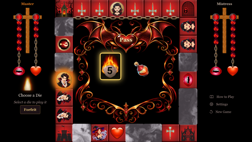
The Apple TV layout from 2021, with the board centred and half of the blood cross on each side, turned out to be the right layout for a phone held sideways too, so it is now the landscape layout everywhere. On a television the two players sit either side of the screen, and their column, with their meter, their flame and their controls, is on their side. The Continue button sits on the side of the player who acts next, and swaps with the turn. It sounds odd written down. In use it is the obvious thing.
Where It Stands
Fangs & Hearts has been approved late September 2026 just in time for Halloween. One price gets iPhone, iPad and Apple TV together. The full rules and feature overview are on our Sexy Suggestions site, and this link will go to the App Store directly. If you prefer a game you can hold, the vampire themed word search books that grew out of the same design are below. And if you are designing an adult game of your own, the two lessons I would pass on are these: design for the moments when nobody is looking at the board, and let the players keep their own score.
Give Her Great Oral Sex Today

